


The first thing I do when joining a new company: Building a growth dashboard 📊
Part 1: Growth dashboards (template included)

As some of you may have seen, I recently joined Live It Up as its new Performance Marketing Lead:

My first few weeks have been a mix of onboarding calls, brand docs and time spent digging into past performance.
It has also been a great time for me to get back to the basics of marketing (and go deep into the data).
This post will be all about the data piece and more specifically, the growth dashboard that I like to build to help me get a grip on what’s happening in the business (template here).
Let’s get to it!
Building out a growth dashboard
A few of you reached out after my last post and asked for a template of the growth dashboard that I mentioned there.
For those that reached out, thank you!
It’s awesome to hear about what is resonating and what you would like to see more of.
Also, perfect timing.
I recently built out a growth dashboard for Live It Up and it’s the first thing that I check each morning to see how performance is trending.
Here’s a recap of tips for growth dashboards in case you missed it from my last post:
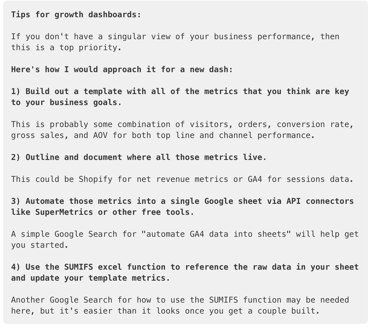
I usually build out some version of a growth dashboard for each company that I join or work with.
It helps me get a grip on all the key metrics.
And, it acts as my command and control center while I am working in the day to day.
The dashboards that I build are not super fancy or complex (it’s just a Google Sheet with some aggregated metrics).
But, I think the simplicity of the views has helped me dial in on what’s most important to move the business metrics.
I hope it serves as an inspiration point for your own dashboards.
A good dashboard should help answer 90% of the daily questions that come up, which frees up time to actually fix whats broken vs trying to figure out whats broken.
In short:
The growth dashboard answers the “what’s happening?” questions.
The team (or yourself) answers the “what do we do about it?” questions.
With that said, here are the first 3 tabs that I like to build to get my growth dashboard up and running (template here):
Summary tab
Monthly tab
Weekly trends tab
Side note: I think the process of building the dashboard is just as valuable as having it stood up and running each morning.

It forces me to look at all the key metrics and gain a deeper understanding of what's driving the business.

Then, as I build it out I can take notes on the side of anything that seems out of ordinary.

IE: Why is CAC spiking in this channel the past few months?

These notes are later used as a guide for building out my priority list for upcoming work (we can save priority lists for another post 🙂).
Summary tab
The first tab I like to build is called the “Summary” tab.
It highlights year-over-year (YoY) performance across the key metrics that are important to the business.
And, I usually build a quarter-to-date (QTD) and month-to-date (MTD) version of the table, but it’s the same metrics across both.
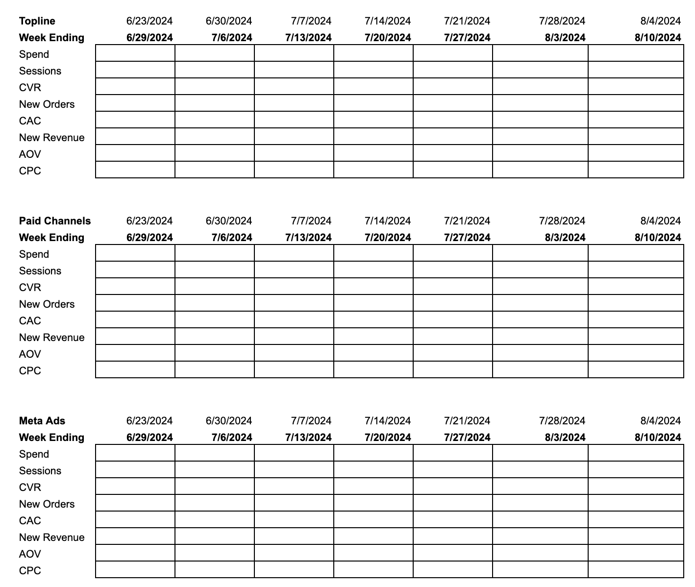
The metrics that I include here brings in the standard e-commerce formula metrics: Sessions x Conversion Rate x AOV = Gross Sales ($).
And then I also add in a few efficiency metrics like CAC and CPC’s.
This view helps me understand if we are seeing any issues with the volume that is being driven (like changes to spend, sessions or orders) and/or if we have any issues with our ad spend efficiency.
Here’s an example of what that tab usually looks like:

The example I shared in the template and above includes the following metrics, but feel free to modify this as it relates to your business:
Spend
Includes total spend from all of the advertising channels.
This is usually some combination of affiliate commissions + paid media spend + any spend from flat fee deals.
Some folks may include VIP gifting, agency fees and brand partnership costs here as well, but I like to look at those separately.
Paid media spend in this example is the sum of all the digital channels (IE: Meta ads, Google Ads, TikTok ads, etc.).
Sessions
I’m currently just pulling in total sessions from GA4 for this metric.
New Orders
These are new orders coming out of Shopify for the top line metrics.
I use the conversions found in the ad platforms here for the paid channels.
CVR
Is just a calculated field as: CVR = new orders / sessions.
Paid CVR is: CVR = conversions / clicks
CAC
Another calculated field of: CAC = Spend / new orders (or conversions for paid channels)
New revenue
This is also pulled from Shopify for top line metrics.
I use the conversion value metrics in platform for the paid channels here.
CPC
Another calculated field of: CPC = Cost / sessions (or clicks for paid channels)
AOV
Calculated as: AOV = new revenue / new orders
Orders overlap
This is calculated as: Orders overlap = paid conversions (ad platform data) / new customers (Shopify orders)
This helps me understand how much we are double counting orders on the paid side and it directionally helps me understand paid incrementality.
It’s not a perfect science, but a high overlap rate (+30%) could indicate that we are overpaying for orders across the digital channels that might have occurred anyways. This may lead to cuts in spend across campaigns if I think we can trim budgets in less incremental areas (IE: brand search), but still retain top line new customer counts.
Revenue overlap
Same as orders overlap, but for revenue: Revenue overlap = conversion value (ad platform data) / new revenue (Shopify)
The Summary tab helps me quickly answer the "what's happening" questions for the QTD and MTD views.

IE:
1) What is MTD CAC and how is that trending vs last year?

2) How are sales trending?

3) If sales are down, then what are the drivers?

I include the metrics found in the e-commerce formula of (sessions x conversion rate x AOV = gross sales) alongside the efficiency metrics to help me diagnose where the big problem areas are.
The answers to the above questions then kicks us into the next 2 tabs of:
Monthly Trends
Weekly Trends
Monthly Trends tab
The Summary tab is helpful as a quick check for how performance is looking in period (QTD or MTD), but it doesn’t tell me the full story of how metrics are changing over time.
For that, I like to look at trended data.
The Monthly Trends tab uses all the same metrics from the Summary tab, however, it’s trended out month over month.
Here’s an example of what that might look like:

This view helps me isolate if a problem found on the Summary tab (like an increase in CAC) is specific to the current month or it has it been trending poorly over a period of time.
For example, if I notice a drop in performance beginning in June, then I can focus my next analysis there to see what changed in June.
The Monthly trends tab helps me understand how the key metrics are trending over time.

It then helps me narrow in on a specific period if I notice any big changes in performance.
The monthly tab then leads us into the weekly trends tab.
Weekly Trends tab
The 3rd tab that I build out is the Weekly Trends tab.
This is the double click of the metrics found on the Monthly trends tab, but its trended out weekly.
This is also the tab where I like to bring in charts for visualizing the trends over time.
Here’s an example of what that might look like (mock data here for the visualization):

This view is helpful for seeing changes in performance week-over-week (WoW) and year-over-year (YoY).
It also lets me know if we are trending up (or down) based solely on seasonality factors or if the changes that we are making are improving the numbers from last years baseline.
I’ve built daily versions of this in the past as well, but I would probably start with the weekly view to get started.
The Weekly Charts tab is probably where I probably spend the most of my time reviewing performance.

I like to build versions of this out for all the key metrics for both top line performance and each channels performance.
Bonus tab: Funnel Trends tab
If you’ve made it this far, then it’s only right to share one more bonus tab with you.
The last tab that I like to build out is the Funnel Trends tab.
This tab double clicks into how the core funnel is performing in regards to moving someone from a product page view to a purchase.
Here’s what that looks like:

A use case for this view could include if changes made on the product page are improving (or hurting) add to cart rates.
Or, if traffic quality changes are leading to a drop in folks who are ready to convert.
The same goes for any cart or checkout page changes.
Here’s an example template for the chart views:

The Funnel Trends tab typically includes the following metrics:
Product page views
The amount of people who landed on the product page.
Add to cart views
The amount of people who added a product to their cart.
Add to cart rate
Calculated as: Add to cart rate = add to cart views / product page views
Checkout views
The amount of people who made it checkout.
Checkout rate
Calculated as: Checkout rate = checkout views / add to cart views
Purchases
The amount of people who purchased.
Purchase rate
Calculated as: Purchase rate = purchases / checkout
You can also include the standard conversion rate metrics here as well (calculated as: Conversion rate = purchases / total sessions) to help see if a particular stage in the funnel is impacting the total conversion rate performance.
The Funnel Metrics tab is helpful for diagnosing any issues within the core checkout funnel.

If you are running a lot of product page and/or checkout page tests, then this can be a helpful guide to see if those changes are hurting or improving your core funnel metrics over time.
Summary
I hope the above helps you get started on building out your own growth dashboard.
Mine are always consolidating and expanding based on the current business needs and I will try to share more updated versions with you as they come up!
To recap:
Growth Dashboard:
A simple yet powerful tool, can be built in Google Sheets for low cost, that aggregates critical metrics.
It acts as a command center for daily operations, helping to quickly identify what’s happening in the business.
Core tabs to include:
Summary tab: Provides a year-over-year view of performance, focusing on metrics like CAC, sales, and CVR. It helps quickly answer the “what’s happening?” questions.
Monthly Trends tab: Tracks metrics over time, allowing you to identify if performance changes are isolated or part of a trend.
Weekly Trends tab: Offers a more detailed, week-over-week view of performance, helping you spot seasonal trends or the impact of recent changes.
Funnel Trends tab: A dedicated tab for tracking the customer journey from product page views to purchases, invaluable for diagnosing issues and optimizing the checkout process.
TLDR: Building and maintaining a growth dashboard not only provides clarity, but it also frees up time to focus on actions that move the business forward (instead of spending time digging around for the data).
See you next time!
PS: If you missed my last post on the 5 biggest growth lessons that I’ve learned working in DTC, then feel free to check that out here!